Positioning
Ref: http://www.w3schools.com/css/css_positioning.asp
The CSS positioning properties allow you to position an element. It can also place an element behind another, and specify what should happen when an element's content is too big.
Elements can be positioned using the top, bottom, left, and right properties. However, these properties will not work unless the position property is set first. They also work differently depending on the positioning method.
There are four different positioning methods.
Static Positioning
HTML elements are positioned static by default. A static positioned element is always positioned according to the normal flow of the page.
Static positioned elements are not affected by the top, bottom, left, and right properties.
Fixed Positioning
An element with fixed position is positioned relative to the browser window.
It will not move even if the window is scrolled:
Note: IE7 and IE8 support the fixed value only if a !DOCTYPE is specified.
Fixed positioned elements are removed from the normal flow. The document and other elements behave like the fixed positioned element does not exist.
Fixed positioned elements can overlap other elements.
Relative Positioning
A relative positioned element is positioned relative to its normal position.
h2.pos_left
{
position:relative;
left:-20px;
}
h2.pos_right
{
position:relative;
left:20px;
}
The content of relatively positioned elements can be moved and overlap other elements, but the reserved space for the element is still preserved in the normal flow.
h2.pos_top
{
position:relative;
top:-50px;
}
Relatively positioned elements are often used as container blocks for absolutely positioned elements.
Absolute Positioning
An absolute position element is positioned relative to the first parent element that has a position other than static. If no such element is found, the containing block is :
h2
{
position:absolute;
left:100px;
top:150px;
}
Absolutely positioned elements are removed from the normal flow. The document and other elements behave like the absolutely positioned element does not exist.
Absolutely positioned elements can overlap other elements.
Overlapping Elements
When elements are positioned outside the normal flow, they can overlap other elements.
The z-index property specifies the stack order of an element (which element should be placed in front of, or behind, the others).
An element can have a positive or negative stack order:
An element with greater stack order is always in front of an element with a lower stack order.
An element with greater stack order is always in front of an element with a lower stack order.
Note: If two positioned elements overlap, without a z-index specified, the element positioned last in the HTML code will be shown on top.
All CSS Positioning Properties
The number in the "CSS" column indicates in which CSS version the property is defined (CSS1 or CSS2).
| Property | Description | Values | CSS |
|---|---|---|---|
| bottom | Sets the bottom margin edge for a positioned box | auto length % inherit |
2 |
| clip | Clips an absolutely positioned element | shape auto inherit |
2 |
| cursor | Specifies the type of cursor to be displayed | url auto crosshair default pointer move e-resize ne-resize nw-resize n-resize se-resize sw-resize s-resize w-resize text wait help |
2 |
| left | Sets the left margin edge for a positioned box | auto length % inherit |
2 |
| overflow | Specifies what happens if content overflows an element's box | auto hidden scroll visible inherit |
2 |
| position | Specifies the type of positioning for an element | absolute fixed relative static inherit |
2 |
| right | Sets the right margin edge for a positioned box | auto length % inherit |
2 |
| top | Sets the top margin edge for a positioned box | auto length % inherit |
2 |
| z-index | Sets the stack order of an element | number auto inherit |
2 |
Ref: http://www.w3schools.com/cssref/pr_class_position.asp
Position an h2 element:
h2
{
position:absolute;
left:100px;
top:150px;
}
Definition and Usage
The position property specifies the type of positioning method used for an element (static, relative, absolute or fixed).
Default value: static
Inherited: no
Version: CSS2
JavaScript syntax: object.style.position="absolute"
The position property is supported in all major browsers.
Note: The value "inherit" is not supported in IE7 and earlier. IE8 requires a !DOCTYPE. IE9 supports "inherit".
Property Values
static Elements renders in order, as they appear in the document flow. This is default.
absolute The element is positioned relative to its first positioned (not static) ancestor element
fixed The element is positioned relative to the browser window
relative The element is positioned relative to its normal position, so "left:20" adds 20 pixels to the element's LEFT position
inherit The value of the position property is inherited from the parent element
Ref: http://www.tizag.com/cssT/position.php
CSS Position
With the knowledge of CSS Positioning you will be able to manipulate the exact position of your HTML elements. Designs that previously required the use of JavaScript or HTML image maps may now be done entirely in CSS. Not only is it easier to code, but it also loads much quicker!
Position Relative
Relative positioning changes the position of the HTML element relative to where it normally appears. If we had a header that appears at the top of our page, we could use relative positioning to move it a bit to the right and down a couple of pixels. Below is an example.
CSS Code:
p { position: relative; left: -10px; }
You probably noticed that you define the four possible directions (left, right, up, and down) using only two (left and top). Here's a quick reference when moving HTML elements in CSS.
Move Left - Use a negative value for left.
Move Right - Use a positive value for left.
Move Up - Use a negative value for top.
Move Down - Use a positive value for top.
Position Absolute
With absolute positioning, you define the exact pixel value where the specified HTML element will appear. The point of origin is the top-left of the browser's viewable area, so be sure you are measuring from that point.
Note: Firefox does not currently interpret absolute positioning correctly. However both IE 6.0+ and Opera 8.0+ do.
CSS Code:
p{ position: absolute; top: 75px; left: 75px; }
Specifying a direction with absolute positioning is the same as relative positioning.
Ref: http://www.barelyfitz.com/screencast/html-training/css/positioning/
Learn CSS Positioning in Ten Steps
This tutorial examines the different layout properties available in CSS: position:static, position:relative, position:absolute, and float.
| 1. position:static
The default positioning for all elements is position:static, which means the element is not positioned and occurs where it normally would in the document. Normally you wouldn't specify this unless you needed to override a positioning that had been previously set. |
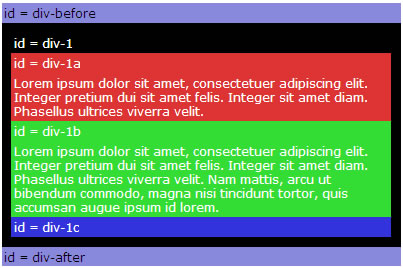 #div-1 { position:static; } |
| 2. position:relative
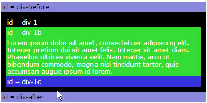
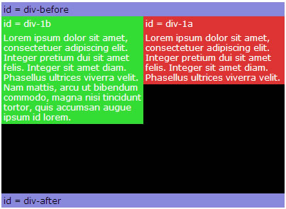
If you specify position:relative, then you can use top or bottom, and left or right to move the element relative to where it would normally occur in the document. Let's move div-1 down 20 pixels, and to the left 40 pixels: |
 #div-1 { position:relative; top:20px; left:-40px; } Notice the space where div-1 normally would have been if we had not moved it: now it is an empty space. The next element (div-after) did not move when we moved div-1. That's because div-1 still occupies that original space in the document, even though we have moved it. |
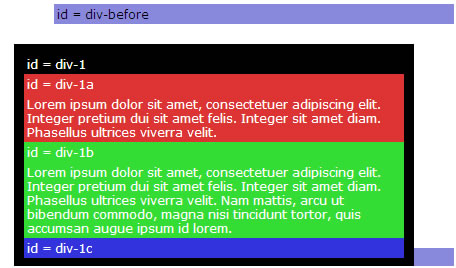
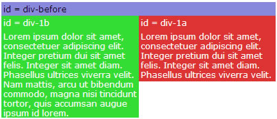
| 3. position:absolute When you specify position:absolute, the element is removed from the document and placed exactly where you tell it to go. Let's move div-1a to the top right of the page: |
 #div-1a { position:absolute; top:0; right:0; width:200px; } Notice that this time, since div-1a was removed from the document, the other elements on the page were positioned differently: div-1b, div-1c, and div-after moved up since div-1a was no longer there. |
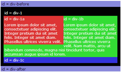
4. position:relative + position:absolute If we set relative positioning on div-1, any elements within div-1 will be positioned relative to div-1. Then if we set absolute positioning on div-1a, we can move it to the top right of div-1: |
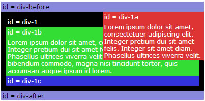 #div-1 { position:relative; } #div-1a { position:absolute; top:0; right:0; width:200px; } |
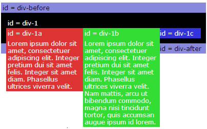
5. two column absolute |
#div-1 { position:relative; } #div-1a { position:absolute; top:0; right:0; width:200px; } #div-1b { position:absolute; top:0; left:0; width:200px; } One advantage to using absolute positioning is that we can position the elements in any order on the page, regardless of the order they appear in the HTML. So I put div-1b before div-1a. |
6. two column absolute height |
 #div-1 { position:relative; height:250px; } #div-1a { position:absolute; top:0; right:0; width:200px; } #div-1b { position:absolute; top:0; left:0; width:200px; } |
| 7. float For variable height columns, absolute positioning does not work, so let's come up with another solution. We can "float" an element to push it as far as possible to the right or to the left, and allow text to wrap around it. This is typically used for images, but we will use it for more complex layout tasks (because it's the only tool we have). |
 #div-1a {
float:left;
width:200px;
}
#div-1a {
float:left;
width:200px;
}
|
8. float columns |
 #div-1a { float:left; width:150px; } #div-1b { float:left; width:150px; } |
| 9. float columns with clear Then after the floating elements we can "clear" the floats to push down the rest of the content. | 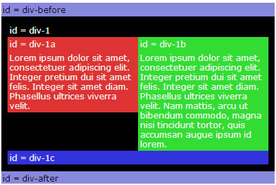 #div-1a { float:left; width:190px; } #div-1b { float:left; width:190px; } #div-1c { clear:both; } |
Ref: http://www.quirksmode.org/css/position.html
The four values
position takes four values: static, relative, absolute, and fixed. static is the default value; for any other value you have to apply a CSS declaration.
The containing block
In order to specify the exact position of the element, you have to add top, bottom, left, and/or right declarations. These all give coordinates relative to the top/left or bottom/right reference point. What is this reference point?
• position: static: No reference point, since a static block cannot be moved.
• position: relative: The position the block would take if it were not moved (i.e. if it had position: static).
• position: absolute: The containing block, which is the first ancestor element that does not have position: static.
If there is no such ancestor, the < html> element serves as the containing block. (Note: in older browsers the < body> element serves as the default containing block.)
- position: fixed: The viewport (browser window).
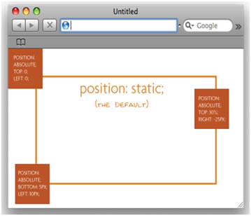
static
An element with position: static always has the position the normal flow of the page gives it. It cannot be moved from this position; a static element ignores any top, bottom, left, or right declarations.
relative
An element with position: relative initially has the position the normal flow of the page gives it, but it is subsequently offset by the amount the top, bottom, left, and/or right declarations give. Therefore, in combination with such a declaration it appears slightly skewed. The space the element originally took remains empty.
By themselves, relatively positioned elements are uninteresting, since you almost never want to skew an element by a few pixels. However, a relatively positioned element serves as a containing block; and this is the usual reason to use position: relative.
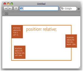
absolute
An element with position: absolute is taken out of the normal flow of the page and positioned at the desired coordinates relative to its containing block.
Since the absolutely positioned element is taken out of the normal flow, the normal document flow behaves as if the element is not there: it closes up the space it would take.
fixed
An element with position: fixed is taken out of the normal flow of the page and positioned at the desired coordinates relative to the browser window. It remains at that position regardless of scrolling.
[In IE7, if you select "absolute" or "fixed" and then "relative", most of the layer’s content doesn’t show.
In Safari 4 and Chrome 5, if you select "relative" and then "static", the green layer is misplaced.]
Ref: http://css-tricks.com/791-absolute-positioning-inside-relative-positioning/
Absolute Positioning Inside Relative Positioning
by: Chris Coyier
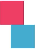
A page element with relative positioning gives you the control to absolutely position children elements inside of it. |
 |
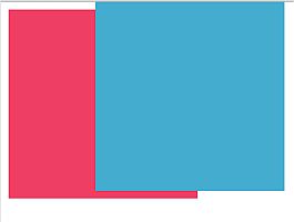
The relative positioning on the parent is the big deal here. Look what would happen if you forgot that: |
 |
Might not look like a big deal in this small example, but it really is a significant change. What is happening is the absolutely positioned elements are positioning themselves in relation to the body element instead of their direct parent. So if the browser window grows, that one in the bottom left is going to stick with the browser window, not hang back inside like his well behaved brother from the first image.
Once you "wrap" your head around this concept (rim-shot) you will find little uses for it all over the place, and start noticing examples of other places using it. It's like when you learn a new word and then you start hearing it everywhere. Yeah.
Ref: http://www.alistapart.com/articles/css-positioning-101/
CSS Positioning 101
BY Noah Stokes
If you’re a front end developer or a designer who likes to code, CSS-based layouts are at the very core of your work. In what might be a refresher for some, or even an “a-ha!” for others, let’s look at the CSS position property to see how we can use it to create standards-compliant, table-free CSS layouts.
Position is everything
CSS positioning is often misunderstood. Sometimes, in a bug-fixing fury, we apply different position values to a given selector until we get one that works. This is a tedious process that can work for a time, but it behooves us to know why specifying something like position: relative can fix your layout bug. My hope is that we can learn the position property’s values and behaviors, and most importantly, how a value can affect your markup. The CSS specification offers us five position properties: static, relative, absolute, fixed, and inherit. Each property serves a specific purpose. Understanding that purpose is the key to mastering CSS-based layouts.
Get with the flow
First, let’s take a step back to recognize the world we’re working in. Much like our real world, in CSS, we work within boundaries. In CSS, this boundary is called the normal flow. According to the CSS 2.1 spec:
Boxes in the normal flow belong to a formatting context, which may be block or inline, but not both simultaneously. Block boxes participate in a block formatting context. Inline boxes participate in an inline formatting context.
Think of a “box,” as described by the spec as a wooden block—not unlike the ones you played with as a young whippersnapper. Now, think of the normal flow as a law similar to the law of gravity. The normal flow of the document is how your elements stack one on top of each other, from the top down, in the order in which they appear in your markup. You may remember stacking alphabet blocks into giant towers: The normal flow is no different than those wooden blocks bound by the law of gravity. As a child, you had one block on top of another; in your markup, you have one element after another. What you couldn’t do as a child, however, was give those blocks properties that could defy the law of gravity. All of the sudden, CSS seems a lot cooler than those alphabet blocks.
Static and relative—nothing new here
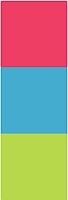
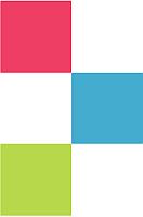
The static and relative position properties behave like your childhood blocks—they stack as you would expect. Note that static is the default position value of an element, should you fail to apply any other value. If you have three statically positioned elements in your code, they will stack one on top of the next, as you might expect. Let’s take a look at an example with three elements, all with a position value of static:
#box_1 { position: static; width: 200px;height: 200px; background: #ee3e64; }
#box_2 { position: static; width: 200px;
height: 200px; background: #44accf; }
#box_3 { position: static; width: 200px;
height: 200px; background: #b7d84b; }
 |
In example A, you can see three elements stacked like a simple tower. Fascinating, isn’t it? This is block building 101. Congratulations! |
You can use the static value for simple, single-column layouts where each element must sit on top of the next one. If you want to start shifting those elements around using offset properties such as top, right, bottom, and left, you’re out of luck. These properties are unavailable to a static element. In fact, a static element can’t even create a new coordinate system for child elements. Wait. What? You lost me at coordinate system. Roger that, Roger. Let’s explain using the relative value.
Relatively positioned elements behave just like statically positioned elements; they play well with others, stack nicely, and don’t cause a ruckus. Hard to believe, right? Take a look at our previous example. This time, we’ve applied the relative value:
height: 200px; background: #ee3e64; }
#box_2 { position: relative; width: 200px;
height: 200px; background: #44accf; }
#box_3 { position: relative; width: 200px;
height: 200px; background: #b7d84b; }
Example B proves that relatively positioned elements behave exactly the same way as statically positioned elements. What you may not know is that elements with a relative position value are like Clark Kent—they hide far greater powers than their static siblings. |
 |
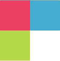
For starters, we can adjust a relatively positioned element with offset properties: top, right, bottom, and left. Using the markup from our previous example, let’s add an offset position to #box_2:
#box_2 { position: relative; left: 200px; width: 200px;height: 200px; background: #44accf; }
 |
Example C shows this relative positioning in action. Our three blocks are stacked up nicely, but this time the blue block (#box_2) is pushed out 200 pixels from the left. This is where we start to bend the law of gravity to our will. The blue block is still in the flow of the document—elements are stacking one on top of the other—but notice the green block (#box_3) on the bottom. It’s sitting underneath the blue block, even though the blue block isn’t directly above it. When you use the offset property to shift a relatively positioned element, it doesn’t affect the element(s) that follow. The green box is still positioned as if the blue box were in its non-offset position. Try that with your alphabet block tower. |
Creating a coordinate system for child elements is another one of the relative positioning property’s super powers. A coordinate system is a reference point for offset properties. Recall in example C, our blue block (#box_2) is not sitting inside of any other elements, so the coordinate system it’s using to offset itself 200 pixels from the left is the document itself. If we place the #box_2 element inside of #box_1, we’ll get a different result, as #box_2 will position itself relative to the coordinate system from #box_1. For the next example, we won’t change any CSS, we’ll adjust our HTML to move #box_2 inside of #box_1:
HTML =< div id="box_1">
< div id="box_2">< /div>
< /div>
Example D shows our new markup. Because of the new coordinate system, the blue block measures its offset 200 pixels from the left of the red block (#box_1) instead of the document. This practice is more common with elements set to position: absolute—the way you wish you could have built towers when you were younger. |
 |
Absolute—anywhere, anytime
If the relative value acts like Superman, then the absolute value mirrors Inception—a place where you design your own world. Unlike the static and relative values, an absolutely positioned element is removed from the normal flow. This means you can put it anywhere, and it won’t affect or be affected by any other element in the flow. Think of it as an element with a giant strip of velcro on its back. Just tell it where to stick and it sticks. Exactly like the relative value, absolutely positioned elements respond to offset properties for positioning. You can set an element to top: 100px and left: 200px; and that element will sit exactly 100px from the top and 200px from the left of the document. Let’s look at an example using four elements:
#box_1 { position: absolute; top: 0; left: 0;width: 200px; height: 200px; background: #ee3e64; }
#box_2 { position: absolute; top: 0; right: 0;
width: 200px; height: 200px; background: #44accf; }
#box_3 { position: absolute; bottom: 0; left: 0;
width: 200px; height: 200px; background: #b7d84b; }
#box_4 { position: absolute; bottom: 0; right: 0;
width: 200px; height: 200px; background: #ebde52; }
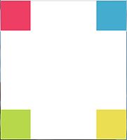 |
Example E shows four boxes, each in a corner of the browser window. Since we set each box’s position value to absolute, we’ve essentially velcroed a box to each corner of our browser window. As you resize the browser, those boxes will stay in their respective corners. If you shrink the browser window so that the boxes overlap, you’ll notice that there is no interaction at all—that’s because they’re out of the document’s normal flow. |
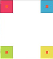
Just like relative elements, absolute elements create a new coordinate system for child elements. Example F extends Example E, with an orange element set inside each box. Notice the offset coordinates are in respect to each parent element. |
 |
Not to be outdone by other position property values, the absolute value offers some really cool functionality using the offset property. Use two or all four offset properties, and you can stretch an element without defining any width or height—it’s bound only by its parent element or the document itself. Let’s see it in action. Consider the following code:
#box_a { position: absolute; top: 10px; right: 10px;bottom: 10px; left: 10px; background: red; }
#box_b { position: absolute; top: 20px; right: 20px;
bottom: 20px; left: 20px; background: white; }
 |
In example G we’ve created a border offset 10 pixels by the document, and it’s entirely fluid as the document resize—all with absolute positioning and offsets. In another example, we can create a two-column layout that fills the entire height of the document. Here is the CSS: |
bottom: 0; left: 0; background: #ee3e64; }
#box_2 { position: absolute; top: 0; right: 0;
bottom: 0; left: 80%; background: #b7d84b; }
Example H shows a full-screen, two-column layout. While this likely isn’t the best approach to a two-column layout, it still shows the power the absolute value holds. Using some creative thinking you can find several useful applications for position: absolute. Similar tricks use only a single offset value. For example: |
 |
#box_2 { position: absolute; left: 100px; width: 200px;
height: 200px; background: #44accf;
 |
In example H2, focus on the blue block (#box_2). Notice how I use only one offset, left: 100px;. This allows the #box_2 element to maintain its top edge and still shift 100 pixels to the left. |
If we applied a second offset to the top, we would see that our blue block (#box_2) is pulled to the top of the document. See that here, in example H3: |
 |
width: 200px; height: 200px; background: #44accf; }
Fixed—always there
An element with position: fixed shares all the rules of an absolutely positioned element, except that the viewport (browser/device window) positions the fixed element, as opposed to any parent element. Additionally, a fixed element does not scroll with the document. It stays, well...fixed. Let’s look at an example:
#box_2 { position: fixed; bottom: 0; left: 0; right: 0; } |
Example I shows a footer with some copyright text in it as a fixed element. As you scroll, notice that it doesn’t move. Notice that the left and right offset properties are set to zero. Since the fixed value behaves similar to the absolute value, we can stretch the width of the element to fit the viewport while fixing the element to the bottom using bottom: 0;. |
Use caution with the fixed value: Support in older browsers is spotty at best. For example, older versions of Internet Explorer render fixed elements as static elements. And, you now know that static elements don’t behave like fixed elements, right? If you do plan to use fixed elements in a layout, there are several solutions that can help make your element behave properly in browsers that don’t support the fixed value.
Inherit—Something for nothing
As I mentioned at the beginning of this article, there are five values available to the position property. The fifth value is inherit. It works as the name implies: The element inherits the value of its parent element. Typically, position property elements do not naturally inherit their parent’s values—the static value is assigned if no position value is given. Ultimately, you can type inherit or the parent element’s value and get the same result.
In action
All this talk and no action. Let’s take a look at a real-world example website that uses all the position values. Example J shows a typical website layout with a header, navigation, content, and footer. Let’s walk through each element, discuss its position property, and why we chose that property. |
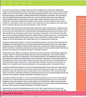 |
Let’s start with our #container element. This is simply the containing element that I’m using to center our content within the viewport. The #nav element is the first element within our #container element. No position property is assigned to the #nav element, so by default, it’s set to static. This is fine: We don’t need to do anything to offset this element, or create any new coordinate systems with it.
We will need to do that with #content on our next element, so for that element, we’ve applied a position property of relative.
Since we’re not using any offsets here, the position value has no real influence on the #content element, but we placed it there to create a new coordinate system for the #callout element. Our #callout element is set to position: absolute, and since its parent element, #content is set to relative, the offset properties we’re using on #callout are based off the coordinates created by #content. The #callout element uses a negative 80px pixel offset on the right to pull the element outside of its containing parent element. Additionally, I’ve used one of the cooler features of the absolute value on our #callout element: by setting the top and bottom offsets to 100px, I’ve stretched the #callout element to the full height of the document minus the 100px offset on top and bottom.
Since the #callout element has an absolute value, it does not affect other elements. Therefore, we need to add some padding to the #content element to keep our paragraphs from disappearing beneath it. Setting the padding on the right of #content to 250px keeps our content in full view for our users. To bring up the rear, we’ve added a footer with a fixed position to keep it fixed to the bottom of the page. As we scroll, our footer stays in place. Just as we added padding to the #content to keep our paragraphs from disappearing under it, we need to do the same for the #footer element as it is a sibling of the absolute value. Adding 60px to the #content element’s bottom padding ensures that we can scroll the entire document and not miss any text that would normally be hidden under the #footer element.
Now we have a nice, simple layout with navigation, some content, a callout area, and a footer using static, relative, absolute, and fixed elements. Since we’re using the fixed value in this layout, we should apply some techniques to make sure that older browsers still respect our design.
Conclusion
With the position property’s power, you can accomplish many a layout with confidence and success. Thankfully, 80% of the position property values have excellent support in both modern and older browsers. The fixed value is the one that you should watch out for. Understanding the core of these property values gives you a solid CSS-based layout foundation, limited only by your imagination. Hopefully, your days of guessing position values in a last-minute bug fix frenzy are now over.